This morning I tweeted:
In this post, I will therefore be working with matplotlib. In terms of data visualization, I’m more familiar with R and ggplot2, and so this is a perfect opportunity to explore matplotlib. But first I will need data.
The Jupyter Notebook for this little project is found here.
Acquiring the data for data visualization
What data should I use?
As I was asking my younger brother this question, he had League of Legends (LOL) – a multiplayer online battle arena video game – open on his computer screen. Visualizing game data is always fun, and so my brother suggested to use data from the League of Legends: Base champion statistics website.
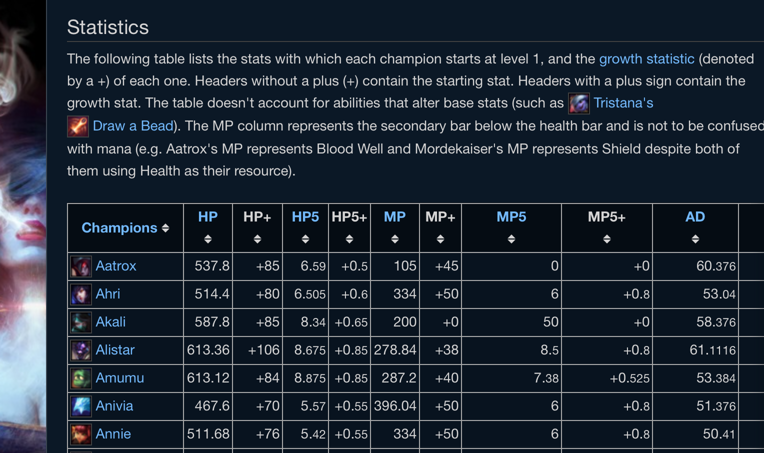
And so, I proceeded to scrape the text off the webpage using BeautifulSoup.
from bs4 import BeautifulSoup
import requests

website_to_parse = "http://leagueoflegends.wikia.com/wiki/Base_champion_statistics"

# Save HTML to soup
html_data = requests.get(website_base_stats).text
soup = BeautifulSoup(html_data, "html5lib")

# Parse table and save to pandas data frame
table = soup.find('table', attrs={'class' : 'wikitable'})
table_body = table.tbody

data = []
rows = table_body.find_all('tr')
for row in rows:
    cols = row.find_all('td')
    if len(cols) == 0: continue
    cols[0] = cols[0].span
    cols = [c.text.strip() for c in cols]
    data.append(cols)

lol_thead = [h.text.strip() for h in soup.find_all("th")]
lol_table = pd.DataFrame(data, columns=lol_thead)
Now that we have data, we can plot.
Data visualization with matplotlib
According to the matplotlib cheatsheet that was tweeted this morning, the components of plotting with matplotlib are:
- Prepare The Data
- Create Plot
- (Use) Plotting Routines
- Customize Plot
- Save Plot
- Show Plot
Preparing the data
The data scraped from the webpage was not in the right format, and further preprocessing steps (mainly the conversion of strings to floats) were required.
Plotting
The following plots were created by …
import matplotlib.pyplot as plt

# Create my plots
fig = plt.figure()
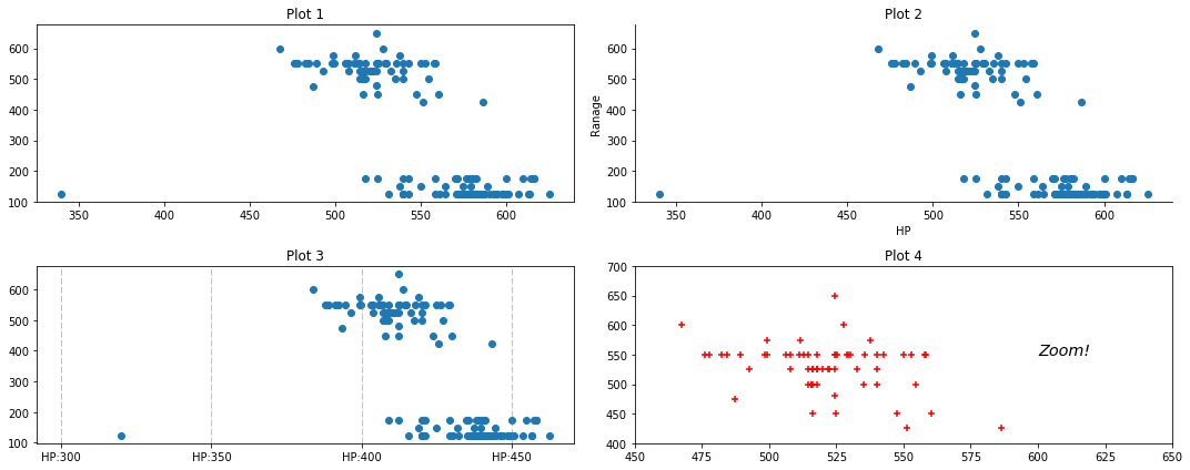
Plot 1
ax1 = fig.add_subplot(221)
ax1.title.set_text('Plot 1')

ax1.scatter(x=lol_table.HP, y=lol_table.Range)
- a generic
scatter-plot with no extra customizations
Plot2
ax2.title.set_text('Plot 2')
ax2 = fig.add_subplot(222)

ax2.scatter(x=lol_table.HP, y=lol_table.Range)
ax2.spines['top'].set_visible(False)
ax2.spines['right'].set_visible(False)
ax2.set(xlabel = "HP", ylabel = "Ranage")
- the top and right plot borders were removed with
spines - x and y axis labels were
set
Plot3
ax3 = fig.add_subplot(223)
ax3.title.set_text('Plot 3')

ax3.scatter(x=lol_table.HP, y=lol_table.Range)
for vline in range(300, 700, 100):
    ax3.axvline(vline, color="grey", linestyle="dashed", linewidth=0.5)
ax3.xaxis.set(
    ticks=range(300, 700, 100),
    ticklabels=["HP:{}".format(x) for x in range(300, 700, 50)]
)
- vertical lines were added and customized with
axvlines - x-axis breaks and labels were set with
xaxis.set
Plot4
ax4 = fig.add_subplot(224)
ax4.title.set_text('Plot 4')

ax4.scatter(x=lol_table.HP, y=lol_table.Range, marker="+", color="red")
ax4.set(
    xlim=[450, 650],
    ylim=[400, 700]
)
ax4.text(600, 550, "Zoom!", style='italic', fontsize="x-large")
- marker type and colour on the scatter plot were specified
- x and y limits were
set textwas added to the plot
In conclusion, use matplotlib.