That is so cool, was my first thought when I saw the following images on a TED talk presented by Ben Wellington, a “data storyteller” from New York.

Reference:
Making data mean more through storytelling | Ben Wellington | TEDxBroadway
Posted 2015. The first 4 images were taken from this reference.
Tips for drawing audiences in
According to Ben, the secret of drawing audiences in and spreading the word is improv comedy. In improv comedy, stories should be relatable to connect with people’s experiences and convey a single idea and be kept simple so that things are not that quickly lost.

He also says to explore things you know best. For him, that’s New York.
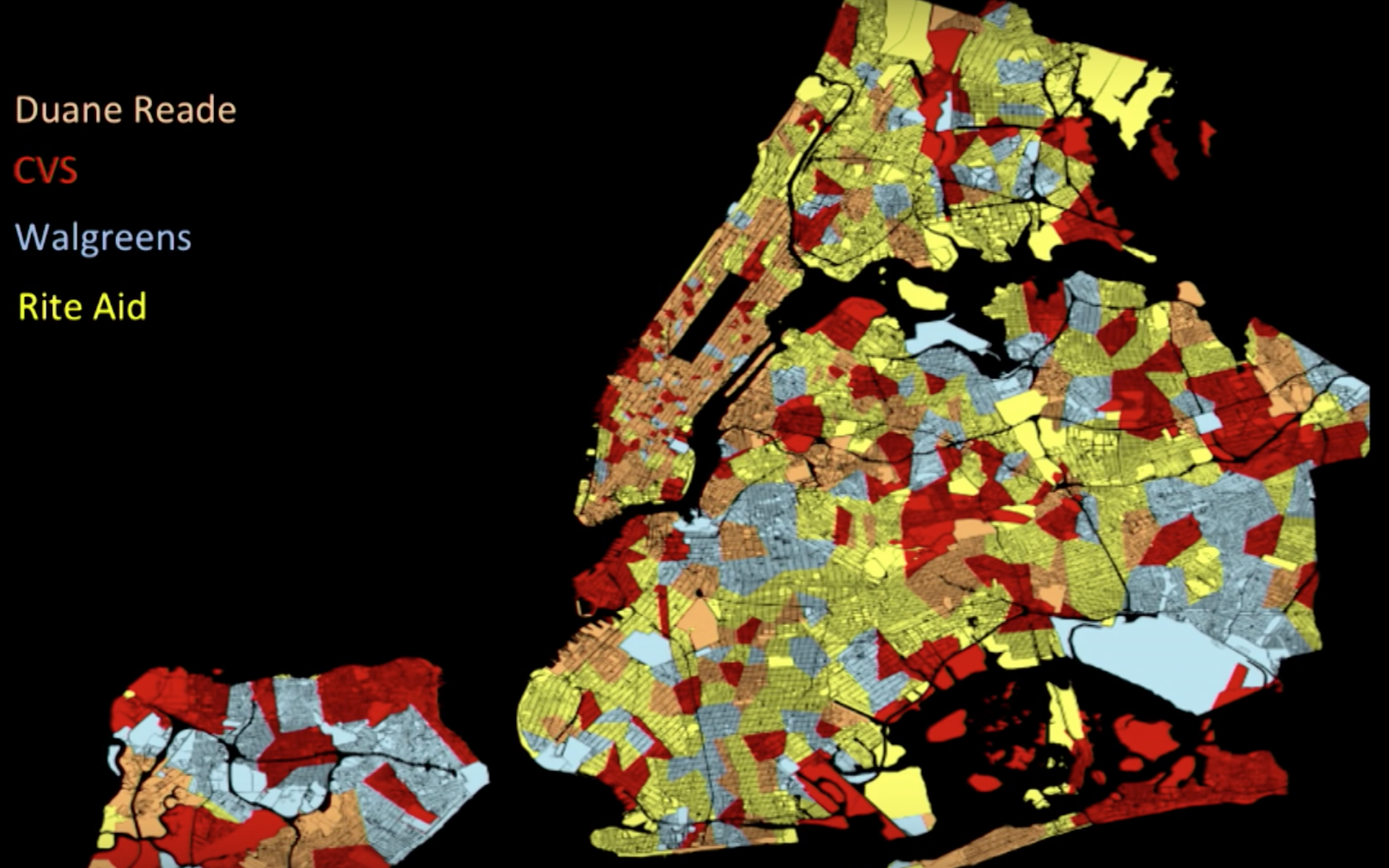
- The first two figures is a mapping of every building in New York coloured by the nearest pharmacy (left is a zoomed in area and right shows that Duane Reade is a Manhattan thing and not New York thing).
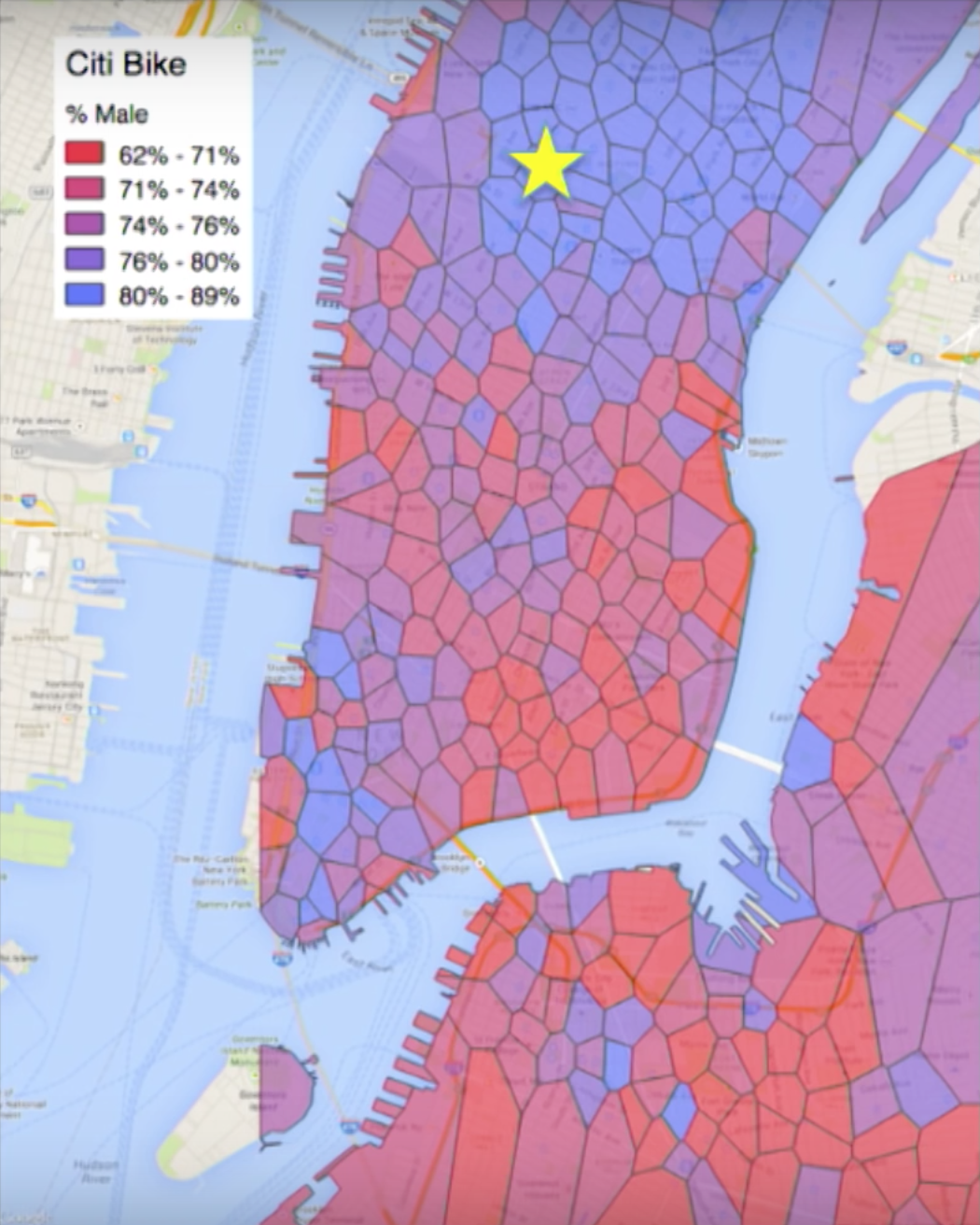
- The following figure is a map of the percent of male and female city bike riders in New York City. (And that if you want to meet a girl, go to Brooklyn.)
k-Nearest Neighbours (kNN) for k=1
I seen these type of maps before.
The maps that were produced by Ben were done using the k-Nearest Neighbours algorithm for k=1. In the first two figures, a building in New York (ie. query point) is assigned to the (k=1) nearest pharmacy (ie. seed/center point). After partitioning the plane to the nearest seed point and getting the decision boundaries, we end up with a Voronoi diagram.
Voronoi diagram - a partitioning of a plane into regions based on distance to points on the plane.
Tessellation - the tiling of a plane using one or more geometric shapes, called tiles, with no overlaps and no gaps.
Voronoi in Python
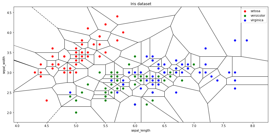
To apply this knowledge and produce my own figure, I used the scipy.spatial.Voronoi function in Python on the Iris dataset (details are found in the Jupyter Notebook here). I also include a code snippet for generating this figure (scroll down).
from scipy.spatial import Voronoi, voronoi_plot_2d

vor = Voronoi(points)

## Draw boundaries
voronoi_plot_2d(vor, show_vertices=False, show_points=False)

## Add colour to points
plt.scatter(x=data["sepal_length"],
            y=data["sepal_width"],
            c=data["target"],
            cmap=matplotlib.colors.ListedColormap(my_colors))

## Add titles
plt.xlabel(points.columns[0])
plt.ylabel(points.columns[1])
plt.title("Iris dataset")

## Add legend
plt.legend((p,p,p), (iris.target_names))
ax = plt.gca()
legend = ax.get_legend()
legend.legendHandles[0].set_color(my_colors[0])
legend.legendHandles[1].set_color(my_colors[1])
legend.legendHandles[2].set_color(my_colors[2])
plt.show()